Have you ever tried to style a radio button or a checkbox ?
If yes! then you know styling these elements are bit tricky and every browser show them differently.
But what if you still want to style them.
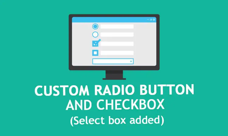
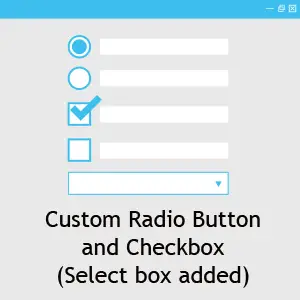
No worries! I will show you how to style custom radio button and checkbox with css only.
In this post you will get to know how to design your custom radio button, checkbox with animation and also custom select boxes.
At the end of the post you will get a free ready to use registration form with all these custom elements in action.
Let’s get started:
First style a radio button
<div class="radio">
    <input type="radio" name="radiogroup1" id="rd1">
    <label for="rd1">Chose me</label>
    <input type="radio" name="radiogroup1" id="rd2">
    <label for="rd2">Chose me</label>
</div>
Let’s write the css for our radio button now.
input[type="radio"] {
  border: 0;
  clip: rect(0 0 0 0);
  height: 1px;
  margin: -1px;
  overflow: hidden;
  padding: 0;
  position: absolute;
  width: 1px;
}
.radio label:before {
  content: "";
  display: inline-block;
  width: 0.5em;
  height: 0.5em;
  margin-right: 0.5em;
  border-radius: 100%;
  vertical-align: -3px;
  border: 2px solid #000;
  padding: 0.13em;
  background-color: transparent;
  background-clip: content-box;
}
.radio label {
  margin-right: 1em;
}
.radio input:hover + label:before {
  border-color: #3dbfef;
}
.radio input:checked + label:before {
  background-color: #3dbfef;
  border-color: #3dbfef;
}
Now as you can see I haven’t used display:none; to hide the input type because it may cause some functional issue for inputs.
We have a label followed by each input, since we have hidden the input we will use that label pseudo elements to make our custom elements.
To make this radio button function properly we have set an id for each radio button and assigned that to the corresponding label in for attribute.
To make the click work we have targeted :checked pseudo element.
Animating the radio buttons
Now we have a working custom radio button but let’s make it look even better by adding some animation on focus.
.radio label:before {
  -webkit-transition: all 0.2s ease;
  transition: all 0.2s ease;
}
Make a custom checkbox
See the html code first
<div class="block checkbox">
    <input type="checkbox" id="cb1">
    <label for="cb1">Click me</label>
</div>
input[type="checkbox"]{
  border: 0;
  clip: rect(0 0 0 0);
  height: 1px;
  margin: -1px;
  overflow: hidden;
  padding: 0;
  position: absolute;
  width: 1px;
}
.checkbox label:before {
  content: "";
  display: inline-block;
  width: 0.5em;
  height: 0.5em;
  margin-right: 0.5em;
  vertical-align: -3px;
  border: 2px solid #000;
  padding: 0.12em;
  background-color: transparent;
  background-clip: content-box;
  -webkit-transition: all 0.2s ease;
  transition: all 0.2s ease;
}
.checkbox label {
  margin-right: 1em;
  position: relative;
}
.checkbox input:hover + label:before {
  border-color: #3dbfef;
}
.checkbox input:checked + label:before {
  border-color: #3dbfef;
}
We can see the html and most of the css are similar to our radio button html and css.
Making a tick
To make the custom tick of the checkbox we have used :after pseudo element.
.checkbox label:after {
  border-right: 3px solid #000000;
  border-top: 3px solid #000000;
  content: "";
  height: 20px;
  left: 2px;
  position: absolute;
  top: 8px;
  transform: scaleX(-1) rotate(135deg);
  transform-origin: left top;
  width: 7px;
  display: none;
}
Animating the tick
Let’s animate the tick with some css animation.
Here is the animation css
@-moz-keyframes check {
  0% {
    height: 0;
    width: 0;
  }
  25% {
    height: 0;
    width: 7px;
  }
  50% {
    height: 20px;
    width: 7px;
  }
}

@-webkit-keyframes check {
  0% {
    height: 0;
    width: 0;
  }
  25% {
    height: 0;
    width: 7px;
  }
  50% {
    height: 20px;
    width: 7px;
  }
}

@keyframes check {
  0% {
    height: 0;
    width: 0;
  }
  25% {
    height: 0;
    width: 7px;
  }
  50% {
    height: 20px;
    width: 7px;
  }
}

.checkbox input:checked + label:after {
  -moz-animation: check 0.8s ease 0s running;
  -webkit-animation: check 0.8s ease 0s running;
  animation: check 0.8s ease 0s running;
  display: block;
  width: 7px;
  height: 20px;
  border-color: #3dbfef;
}
First we created the animation called check and then used in :after pseudo element.
Looking for jQuery version
If you are looking for jquery version of radio button and checkbox you can check these jquery plugins
- iCheck
- Bootstrap Switch
- Switchery
- Bootstrap Checkbox
- Bootstrap Toggle
- Checkator
- Labelauty jQuery Plugin
- Ion CheckRadio
- jQuery Checkradios
- jQuery pretty Checkable
Custom select box
If you try to style a select box you can do that with normal css but you can’t style that dropdown arrow like we did for our radio button and checkbox because pseudo element doesn’t work with select element.
So to work around this we have to use additional <div class="select_arrow"> to make our custom arrow.
Here is the HTML
<div class="select">
  <select>
    <option>Option 1</option>
    <option>Option 2</option>
    <option>Option 3</option>
  </select>
  <div class="select_arrow"></div>
</div>
.select {
  position: relative;
  display: inline-block;
  width: 100%;
  max-width: 300px;
  margin-bottom: 15px;
}
.select select {
  display: inline-block;
  width: 100%;
  padding: 10px 15px;
  cursor: pointer;
  color: #7b7b7b;
  border: 2px solid #000;
  border-radius: 0;
  background: #f1f1f1;
  appearance: none;
  -webkit-appearance: none;
  -moz-appearance: none;
  font-size: 1em;
}
.select select::-ms-expand {
  display: none;
}
.select select:hover,
.select select:focus {
  color: #000;
  background: #e6e6e6;
  border-color: #3dbfef;
}
.select_arrow {
  position: absolute;
  top: calc(50% - 4px);
  right: 15px;
  width: 0;
  height: 0;
  pointer-events: none;
  border-width: 8px 5px 0 5px;
  border-style: solid;
  border-color: #7b7b7b transparent transparent transparent;
}
.select select:hover + .select_arrow,
.select select:focus + .select_arrow {
  border-top-color: #000;
}
To hide the default arrow we have used appearance: none and for IE10 we have used :-ms-expand.
jQuery Select Box
For jquery select box version check these plugins
- jQuery Selectric
- jQuery CustomSelect
- Chosen
- Select2
- jQuery Nice Select
- Image Combo Box
- Multiselect js
- jQuery SumoSelect
- jQuery Bootstrap Select
- Inspiration for Custom Select Elements
Here is the complete demo
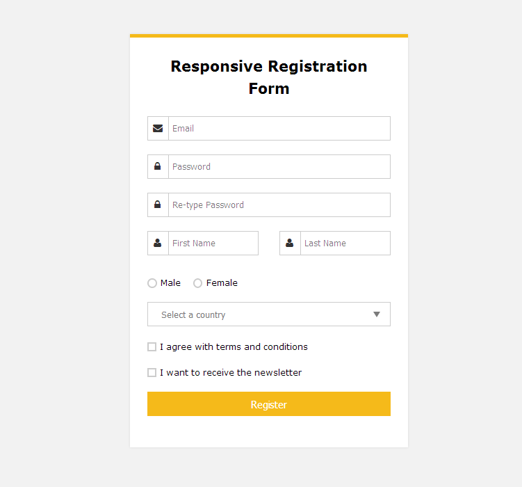
Free responsive registration form
As promised now putting all together I have created this simple registration form for you, feel free to use it.
Do you know any other way to create a custom radio button and checkbox? Do share your comments in the comments section below.
If you found this tutorial helpful do share it with your friends. Happy coding……….. 🙂
Here are some of my favorite website building tools
Thanks for reading the article I hope it was helpful for you. Here are some of my favorite tools that I always use and recommend for website building I hope they will be helpful for you. Please note these are affiliate links, if you do purchase anything using my links I’ll earn a small commission.
Web Hosting: For a new website I like GreenGeeks, I’m using it on this site for over a year now without any problems. They have very affordable plans for beginners and the support is reliable. Their simple setup will get you off and running in no time.
Learn Front End Development: If you want to learn front-end development I recommend Pluralsight, learn from industry professionals. You can try the no-risk 10 days free trial and check the content.
Advertising Network: If you want to increase your ads revenue with Adsense then try using Ezoic, unlike most ad networks it doesn’t need any minimum traffic to get started. It is completely free to use.
Thanks – but I’m having trouble. The circle is to close to the label text. No matter what I do I can seem to change the position. I can change it up and down but await from the label text.. BTW I’m a newbie! Most likely has something to do with me. Using Chrome 64 on Linux
John, thanks for stopping by, make sure you are using all the css properties properly as mentioned here. If that doesn’t solve the problem please re-create the issue in codepen or any other opensource platform that would help me to give you a proper solution.