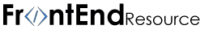
Want to create css buttons?
Then I want to share some tips with you on creating pure css buttons.
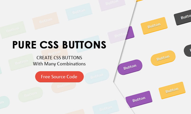
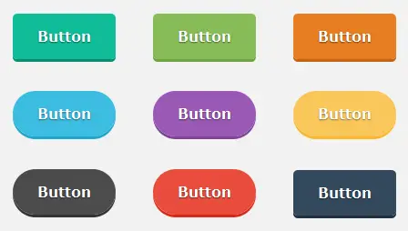
I will show how you can create a huge button set like this one with minimum html and css right now.
Keep reading:
We will go through the html and css separately.
Recommended Reading: Social button templates.
This is our base html structure.
<div>
    <a class="btn green" href="#">Button</a>
    <a class="btn light-green" href="#">Button</a>
    <a class="btn orange" href="#">Button</a>
    <a class="btn blue" href="#">Button</a>
    <a class="btn purple" href="#">Button</a>
    <a class="btn yellow" href="#">Button</a>
    <a class="btn grey" href="#">Button</a>
    <a class="btn red" href="#">Button</a>
    <a class="btn dark-blue" href="#">Button</a>
    <a class="btn ash-grey" href="#">Button</a>
</div>
Main button styling
This css code creates our base style for all buttons.
.btn{
    background:transparent;
    border: 2px solid transparent;
    box-sizing: border-box;
    cursor: pointer;
    font-size: 1rem;
    font-weight: 700;
    line-height: 1;
    margin: 18px;
    padding: 15px 25px;
    text-align: center;
    text-decoration: none;
    display:inline-block;
    outline:none;
    position:relative;
    top:0;
    text-shadow:0 1px 1px rgba(0, 0, 0, 0.5);
    -webkit-transition: all 0.2s ease-in-out 0s;
    -moz-transition: all 0.2s ease-in-out 0s;
    -ms-transition: all 0.2s ease-in-out 0s;
     transition: all 0.2s ease-in-out 0s;
}
Multiple color combinations
Here we will be creating various color options for making our flat css buttons.
.green{
    background:#10bc98;
    color:#fff;
    box-shadow: 0 3px 0 #0c8d72;
}
.green:hover{
    background:#13d7ae;
}
.green:active, .green:focus{
    background:#0fae8d;
}
.light-green{
    background:#87bc58;
    color:#fff;
    box-shadow: 0 3px 0 #6ea140;
}
.light-green:hover{
    background:#c0da82;
}
.light-green:active, .light-green:focus{
    background:#7fb84d;
}
.orange{
    background:#e77e22;
    color:#fff;
    box-shadow: 0 3px 0 #c16515;
}
.orange:hover{
    background:#f6b417;
}
.orange:active, .orange:focus{
    background:#dd7418;
}
.blue{
    background:#3cbce1;
    color:#fff;
    box-shadow: 0 3px 0 #1fa4cb;
}
.blue:hover{
    background:#56d7ed;
}
.blue:active, .blue:focus{
    background:#2fb7df;
}
.purple{
    background:#9a59b5;
    color:#fff;
    box-shadow: 0 3px 0 #7f4497;
}
.purple:hover{
    background:#c472e6;
}
.purple:active, .purple:focus{
    background:#944fb0;
}
.yellow{
    background:#fac75a;
    color:#fff;
    box-shadow: 0 3px 0 #f9b629;
}
.yellow:hover{
    background:#fce17a;
}
.yellow:active, .yellow:focus{
    background:#fac24b;
}
.grey{
    background:#4c4c4c;
    color:#fff;
    box-shadow: 0 3px 0 #333333;
}
.grey:hover{
    background:#747373;
}
.grey:active, .grey:focus{
    background:#444444;
}
.red{
    background:#e84c3d;
    color:#fff;
    box-shadow: 0 3px 0 #d82a1a;
}
.red:hover{
    background:#f57b8a;
}
.red:active, .red:focus{
    background:#e63b2b;
}
.dark-blue{
    background:#34495e;
    color:#fff;
    box-shadow: 0 3px 0 #22303d;
}
.dark-blue:hover{
    background:#425c77;
}
.dark-blue:active, .dark-blue:focus{
    background:#2f4154;
}
.ash-grey{
    background:#bec3c7;
    color:#fff;
    box-shadow: 0 3px 0 #a3aaaf;
}
.ash-grey:hover{
    background:#d0d5d9;
}
.ash-grey:active, .ash-grey:focus{
    background:#b0b6bb;
}
Making rounded corners
Now let’s make the corners rounded.
.rounded{
    border-radius:5px;
}
.full-rounded{
    border-radius:20em;
}
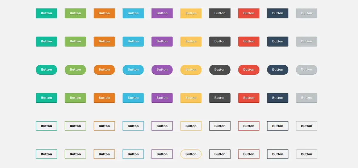
.rounded or .full-rounded.Making 3D buttons with pure css
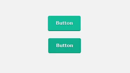
Let’s use some css tricks to make 3D buttons.
.press-me:focus{
    top:3px;
}
.green.press-me:focus{
    box-shadow: 0 2px 0 #0c8d72;
}
.light-green.press-me:focus{
    box-shadow: 0 2px 0 #6ea140;
}
.orange.press-me:focus{
    box-shadow: 0 2px 0 #c16515;
}
.blue.press-me:focus{
    box-shadow: 0 2px 0 #1fa4cb;
}
.purple.press-me:focus{
    box-shadow: 0 2px 0 #7f4497;
}
.yellow.press-me:focus{
    box-shadow: 0 2px 0 #f9b629;
}
.grey.press-me:focus{
    box-shadow: 0 2px 0 #333333;
}
.red.press-me:focus{
    box-shadow: 0 2px 0 #d82a1a;
}
.dark-blue.press-me:focus{
    box-shadow: 0 2px 0 #22303d;
}
.ash-grey.press-me:focus{
    box-shadow: 0 2px 0 #a3aaaf;
}
.press-me class for making buttons 3D.Making the button transparent
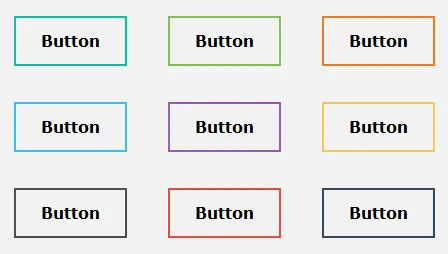
Now we will be making the transparent buttons.
.transparent{
    background:none;
    box-shadow:none;
    text-shadow:none;
    color:#000;
}
.green.transparent{
    border-color:#10bc98;
}
.light-green.transparent{
    border-color:#87bc58;
}
.orange.transparent{
    border-color:#e77e22;
}
.blue.transparent{
    border-color:#3cbce1;
}
.purple.transparent{
    border-color:#9a59b5;
}
.yellow.transparent{
    border-color:#fac75a;
}
.grey.transparent{
    border-color:#4c4c4c;
}
.red.transparent{
    border-color:#e84c3d;
}
.dark-blue.transparent{
    border-color:#34495e;
}
.ash-grey.transparent{
    border-color:#bec3c7;
}
.transparent class to make buttons transparent.Animated buttons with css3
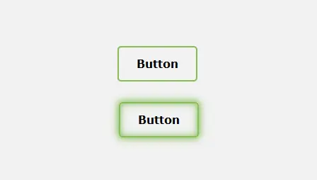
Let’s make animated buttons by using some css selectors and css3 properties.
[class*='effect-']:hover, [class*='effect-']:active, [class*='effect-']:focus{
    background:none;
}
[class*='effect-']:after {
  	content: "";
    position: absolute;
    -webkit-transition: all 0.3s ease 0s;
    -moz-transition: all 0.3s ease 0s;
    -ms-transition: all 0.3s ease 0s;
    transition: all 0.3s ease 0s;
    z-index: -1;
}
.rounded[class*='effect-']:after {
  	border-radius:5px;
}
.full-rounded[class*='effect-']:after {
  	border-radius:20em;
}
.effect-left:after{
    height: 100%;
    left: 0;
    top: 0;
    width: 0;
}
.effect-left:hover:after{
    width:100%;
}
.effect-right:after{
    height: 100%;
    right: 0;
    top: 0;
    width: 0;
}
.effect-right:hover:after{
    width:100%;
}
.effect-up:after{
    width: 100%;
    left: 0;
    top: 0;
    height: 0;
}
.effect-up:hover:after{
    height:100%;
}
.effect-down:after{
    width: 100%;
    left: 0;
    bottom: 0;
    height: 0;
}
.effect-down:hover:after{
    height:100%;
}
.effect-horiz:after{
    height: 100%;
    left: 50%;
    top: 0;
    width: 0;
}
.effect-horiz:hover:after{
    width:100%;
    left:0;
}
.effect-vart:after{
    width: 100%;
    top: 50%;
    left: 0;
    height: 0;
}
.effect-vart:hover:after{
    height:100%;
    top:0;
}
.effect-box:after{
    width: 0;
    top: 50%;
    left: 50%;
    height: 0;
}
.effect-box:hover:after{
    width: 100%;
    top: 0;
    left: 0;
    height:100%;
}
.effect-down-left:after{
    width: 0;
    top: 0;
    left: 0;
    height: 0;
}
.effect-down-left:hover:after{
    width: 100%;
    height:100%;
}
.effect-up-right:after{
    width: 0;
    right: 0;
    bottom: 0;
    height: 0;
}
.effect-up-right:hover:after{
    width: 100%;
    height:100%;
}
.green.effect-glow:hover{
    box-shadow: 0 0 10px 0 #10bc98 inset, 0 0 10px 2px #10bc98;
}
.light-green.effect-glow:hover{
    box-shadow: 0 0 10px 0 #87bc58 inset, 0 0 10px 2px #87bc58;
}
.orange.effect-glow:hover{
    box-shadow: 0 0 10px 0 #e77e22 inset, 0 0 10px 2px #e77e22;
}
.blue.effect-glow:hover{
    box-shadow: 0 0 10px 0 #3cbce1 inset, 0 0 10px 2px #3cbce1;
}
.purple.effect-glow:hover{
    box-shadow: 0 0 10px 0 #9a59b5 inset, 0 0 10px 2px #9a59b5;
}
.yellow.effect-glow:hover{
    box-shadow: 0 0 10px 0 #fac75a inset, 0 0 10px 2px #fac75a;
}
.grey.effect-glow:hover{
    box-shadow: 0 0 10px 0 #4c4c4c inset, 0 0 10px 2px #4c4c4c;
}
.red.effect-glow:hover{
    box-shadow: 0 0 10px 0 #e84c3d inset, 0 0 10px 2px #e84c3d;
}
.dark-blue.effect-glow:hover{
    box-shadow: 0 0 10px 0 #34495e inset, 0 0 10px 2px #34495e;
}
.ash-grey.effect-glow:hover{
    box-shadow: 0 0 10px 0 #bec3c7 inset, 0 0 10px 2px #bec3c7;
}
All the above class names are respective to their animation style so add them according to your needs.
By Playing around with the classes you can create your own style and combinations of buttons.
You can download the source code here:
If you like the article do post your comments in the section below.
Here are some of my favorite website building tools
Thanks for reading the article I hope it was helpful for you. Here are some of my favorite tools that I always use and recommend for website building I hope they will be helpful for you. Please note these are affiliate links, if you do purchase anything using my links I’ll earn a small commission.
Web Hosting: For a new website I like GreenGeeks, I’m using it on this site for over a year now without any problems. They have very affordable plans for beginners and the support is reliable. Their simple setup will get you off and running in no time.
Learn Front End Development: If you want to learn front-end development I recommend Pluralsight, learn from industry professionals. You can try the no-risk 10 days free trial and check the content.
Advertising Network: If you want to increase your ads revenue with Adsense then try using Ezoic, unlike most ad networks it doesn’t need any minimum traffic to get started. It is completely free to use.

thanks for sharing a creative information.
Glad you liked it.
great!