You may have seen many modern websites and premium templates make the header fixed when you scroll down.
This feature is very useful for a website and more so for a single-page website. A quick navigation option for users adds to the user experience.
I will show you how to make a fixed header on scroll using simple jquery and css3.
You will also get to know how to do this in your WordPress site with some plugins, as well as in your favorite page builder Elementor and how to implement this in your bootstrap or foundation projects too.
Let’s dive into it:
Topics we cover:
Create Fixed header on scroll with jQuery (with CSS transition)

Today we will re-create this fixed header style from Foundry HTML template, it’s one of the most popular HTML templates in ThemeForest.
Disclosure: Some of the links here are referral/affiliate links that means if you decide to buy through those links I’ll earn a commission at no extra cost to you. This is how I keep Frontendresource.com up and running.
Keep reading:
Before we dive into the code let’s break down the steps first. We can break down the entire process in three steps here-
- The header is placed at the top of the layout.
- The header moves up with the rest of the content and goes out of the view.
- It comes back in view as soon as the first section is out of view.
Now we know the steps, let’s move on.
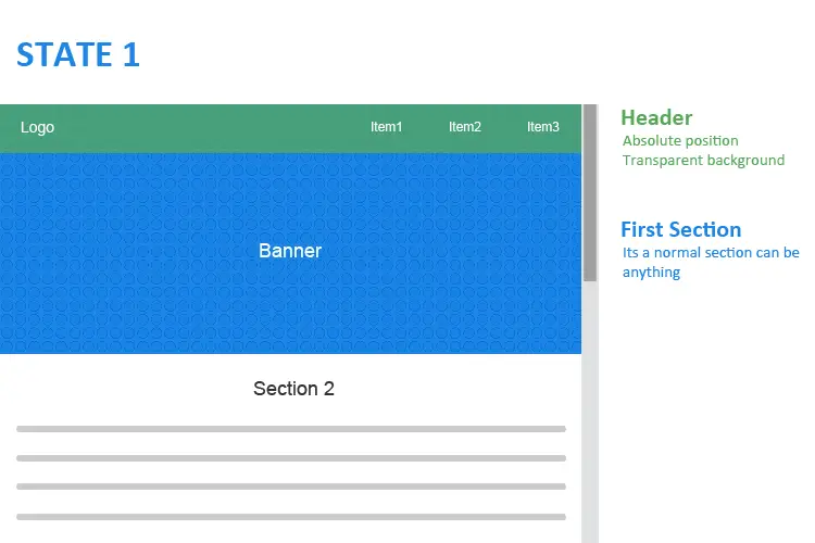
<header class="header">
  <div class="container">
    <div class="logo"><a href="#">Logo</a></div>
    <nav>
      <ul>
        <li><a href="#">About</a></li>
        <li><a href="#">Portfolio</a></li>
        <li><a href="#">Contact</a></li>
      </ul>
    </nav>
  </div>
</header>
<div class="main-container">
  <section class="hero-banner">
    <div class="container">
      <h2>Animated Header On Scroll</h2>
    </div>
  </section>
  <section class="about">
    <div class="container">
      <h2>About</h2>
      <p>"Lorem Ipsum is simply dummy text of the printing and typesetting industry. Lorem Ipsum has been the industry's standard dummy text ever since the 1500s, when an unknown printer took a galley of type and scrambled it to make a type specimen book. It has survived not only five centuries, but also the leap into electronic typesetting, remaining essentially unchanged. It was popularised in the 1960s with the release of Letraset sheets containing Lorem Ipsum passages, and more recently with desktop publishing software like Aldus PageMaker including versions of Lorem Ipsum.
Lorem Ipsum is simply dummy text of the printing and typesetting industry. Lorem Ipsum has been the industry's standard dummy text ever since the 1500s, when an unknown printer took a galley of type and scrambled it to make a type specimen book. It has survived not only five centuries, but also the leap into electronic typesetting, remaining essentially unchanged. It was popularised in the 1960s with the release of Letraset sheets containing Lorem Ipsum passages, and more recently with desktop publishing software like Aldus PageMaker including versions of Lorem Ipsum.
Lorem Ipsum is simply dummy text of the printing and typesetting industry. Lorem Ipsum has been the industry's standard dummy text ever since the 1500s, when an unknown printer took a galley of type and scrambled it to make a type specimen book. It has survived not only five centuries, but also the leap into electronic typesetting, remaining essentially unchanged. It was popularised in the 1960s with the release of Letraset sheets containing Lorem Ipsum passages, and more recently with desktop publishing software like Aldus PageMaker including versions of Lorem Ipsum."</p>
    </div>
  </section>
  <section class="portfolio">
    <div class="container">
      <h2>Portfolio</h2>
      <p>"Lorem Ipsum is simply dummy text of the printing and typesetting industry. Lorem Ipsum has been the industry's standard dummy text ever since the 1500s, when an unknown printer took a galley of type and scrambled it to make a type specimen book. It has survived not only five centuries, but also the leap into electronic typesetting, remaining essentially unchanged. It was popularised in the 1960s with the release of Letraset sheets containing Lorem Ipsum passages, and more recently with desktop publishing software like Aldus PageMaker including versions of Lorem Ipsum.
Lorem Ipsum is simply dummy text of the printing and typesetting industry. Lorem Ipsum has been the industry's standard dummy text ever since the 1500s, when an unknown printer took a galley of type and scrambled it to make a type specimen book. It has survived not only five centuries, but also the leap into electronic typesetting, remaining essentially unchanged. It was popularised in the 1960s with the release of Letraset sheets containing Lorem Ipsum passages, and more recently with desktop publishing software like Aldus PageMaker including versions of Lorem Ipsum.
Lorem Ipsum is simply dummy text of the printing and typesetting industry. Lorem Ipsum has been the industry's standard dummy text ever since the 1500s, when an unknown printer took a galley of type and scrambled it to make a type specimen book. It has survived not only five centuries, but also the leap into electronic typesetting, remaining essentially unchanged. It was popularised in the 1960s with the release of Letraset sheets containing Lorem Ipsum passages, and more recently with desktop publishing software like Aldus PageMaker including versions of Lorem Ipsum."</p>
    </div>
  </section>
</div>
The HTML structure is very simple and self-explanatory.
*{
  margin:0;
  padding:0;
  box-sizing:border-box;
}
img{
  max-width:100%;
}
h2{
  font-size:2.5em;
}
.container{
  width:90%;
  margin:auto;
}
header{
  color:#fff;
  position:absolute;
  display:flex;
  flex-flow: row wrap;
  width:100%;
  top:0;
  left:0;
  z-index:9;
}
header .container{
  display:flex;
  flex-flow: row wrap;
  align-items:center;
  padding:15px 0;
}
.logo{
  font-size:20px;
  text-transform:uppercase;
  font-weight:bold;
}
.logo a{
  color:#fff;
  text-decoration:none;
}
nav {
    justify-content: flex-end;
    display: flex;
    flex: 2 auto;
}
nav ul{
  list-style:none;
  padding:0;
  margin:0;
  display:flex;
  flex-direction: row;
}
nav ul li{
  padding:0.5em;
}
nav ul li a{
  color:#fff;
  text-decoration:none;
  display:inline-block;
}
section{
  padding:150px 0;
}
.hero-banner{
background:url(https://images.unsplash.com/photo-1517946264308-1a7ea8abb6e0?ixlib=rb-0.3.5&q=85&fm=jpg&crop=entropy&cs=srgb&ixid=eyJhcHBfaWQiOjE0NTg5fQ&s=add9d7ca772d122fb699bb1790d89a93) no-repeat center center;
  background-size: cover;
  height:100vh;
  display:flex;
  align-items:center;
  text-align:center;
  position:relative;
  z-index:0;
}
.hero-banner:after{
  content:"";
  display:block;
  background:rgba(0,0,0,0.5);
  left:0;
  top:0;
  height:100%;
  width:100%;
  position:absolute;
}
.hero-banner h2{
  color:#fff;
  position:relative;
  z-index:1;
}
.about{
  text-align:center;
  line-height:2;
}
.portfolio{
  text-align:center;
  line-height:2;
  background:#f1f1f1;
}
In the CSS here we have used flex to align the logo and menu, you can use old fashioned float method to achieve the same result. Notice the header is positioned absolute from the beginning to avoid any flickering in the layout.
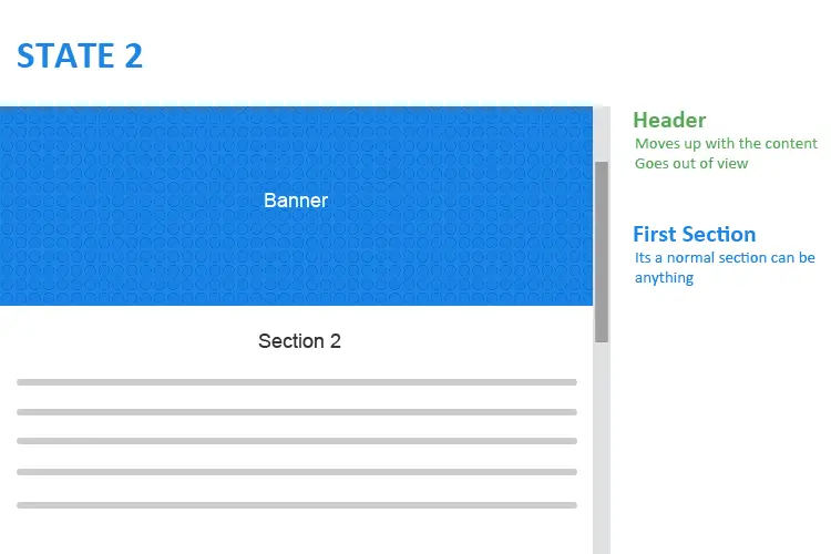
Now moving to the second step, header goes up with the content, for that, we don’t need to do anything with our CSS code but to have that header slide-in in from the top effect we need to add a class on scroll to the header, so we can manipulate that with CSS later.
To add a sticky class in the header when we scroll down, we will write some jQuery.
$(window).scroll(function() {
  var header = $(document).scrollTop();
  var headerHeight = $(".header").outerHeight();
  if (header > headerHeight) {
    $(".header").addClass("fixed");
  } else {
    $(".header").removeClass("fixed");
  }
});
Here we are using jQuery scroll() and scrollTop() method to check when the header has scrolled passed the window. Meanwhile, we are also storing the header height in a variable with outerHeight() method.
header > headerHeight i.e. when the scroll value is higher than the height of the header, it will add .fixed class to it.
Once we have the additional class we can do the rest in CSS.
header.fixed {
  background: #fff;
  position: fixed;
  top: 0;
  left: 0;
  width: 100%;
  opacity:0;
  visibility:hidden;
  box-shadow: 0px 0px 6px 0px rgba(0, 0, 0, 0.2);
  transform:translate(0, -200px);
}
header.fixed nav a, header.fixed .logo a{
  color:#333;
}
In CSS, header position is changed to fixed and visibility is set to hidden. Most importantly for the slide-in effect header x-offset is to -200px.
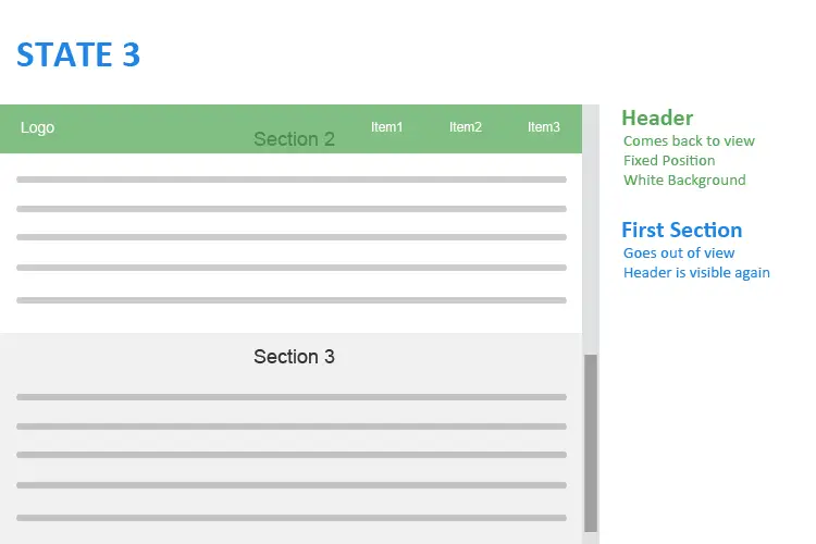
To the last step now, the first section goes out of view and the header slides in from the top. We have hidden the header in the last step, now to make it visible we need to add another class to the header.
$(window).scroll(function() {
  var header = $(document).scrollTop();
  var headerHeight = $(".header").outerHeight();
  var firstSection = $(".main-container section:nth-of-type(1)").outerHeight();
  if (header > headerHeight) {
    $(".header").addClass("fixed");
  } else {
    $(".header").removeClass("fixed");
  }
  if (header > firstSection) {
    $(".header").addClass("in-view");
  } else {
    $(".header").removeClass("in-view");
  }
});
As previously done we will use the same method to get the height of the first section and add .in-view class to the header.
header.in-view{
  opacity:1;
  visibility:visible;
  transition: all 0.3s ease;
  transform:translate(0, 0);
}
In CSS we are making the header visible again and setting x-offset to 0 again. So the header will slide from -200px to 0, giving a smooth slide-in effect with the help of CSS transition.
Modification: In case you want to show the header as soon as it goes out of view, then you don’t need the 3rd step, simply make the header visible in the 2nd step with CSS.
Making it Responsive
We have the header fixed for large screens but the same effect for smaller screens can be a problem for users, to avoid this we will use a small media query-
@media only screen and (max-width: 640px) {
  header.fixed{
    position:relative;
  }
}
Now we won’t have header fixed for any screen size below 640px.
Now let’s join all the parts together and we have the final output here in this codepen.
Fixed header on scroll with CSS
You can have a fixed header with pure CSS no js or jQuery required.
Let’s see:
header{
  background: #fff;
  position: fixed;
  top: 0;
  left: 0;
  width: 100%;
  z-index: 999px;
  box-shadow: 0px 0px 6px 0px rgba(0, 0, 0, 0.5);
}
z-index for the fixed header than the rest of the elements in the layout, this will allow the header to be at the top-level and the rest of the elements will slide under it.I want a fixed table header
If you want a responsive table with a fixed header in bootstrap or in any framework you can do that with CSS as well as with jQuery.
Let’s see both options:
The CSS way
We have used the bootstrap framework here but this process works for any table.
Just set the table elements display mode to display:block and set a height and overflow for tbody.
The jQuery way
For making a fixed header in a table with jQuery you can use these plugins:
Make a sticky header in WordPress with free plugins
There are many free WordPress plugins that you can use to make a sticky header.
Here is the list :
1. Sticky Header by ThematoSoup

This is a very simple plugin to use its almost a plug and play plugin. Once you install you will find few options in the theme customize section.
What are the features?
Features:
- Custom logo
- Custom background and text color
- Choose menu
- Custom container width
- Set when fixed header will appear
- Responsive setting to hide sticky header
Cons:
- No option to change header height from settings
- No setting to show submenu
All in all a very good and lightweight plugin for small sites, especially if you don’t have any submenus. But if you want to show submenu in your sticky header then consider using some other plugins which bring us to our next plugin.
2. Awesome Sticky Header by DevCanyon

This plugin has a lot of settings. If you really want to customize your sticky header you can try this.
Features:
- Custom logo with a max-height option
- Custom background color and image
- Choose the menu and its color
- Menu position
- Submenu depth level
- Custom header width
- Header full-width option
- Set when fixed header will appear
- Custom CSS
- Transparency level
- Responsive setting to hide sticky header
- and more…
Cons:
- It’s not a con but it has so many options it can be confusing for entry-level users.
This plugin is full of features and if used properly you can have a lot of options.
3. Sticky Menu (or Anything!) on Scroll

By the name of the plugin you can guess it will make anything sticky, you are right it can make any element sticky. Once installed you get the options under the settings menu.
Features:
- You can make any element sticky with its class or id or unique tag name(Header, Nav, Footer etc)
- Responsive option for small and large screen
- Push up an element (If you want your sticky element to be ‘pushed up’ again by another element lower on the page you can do that)
- Custom z-index value
Cons:
- You need to know the elements class or id or unique tag to use this plugin because it’s not developed for the sole purpose of making a header sticky.
- The effect is not as good as the other plugins mentioned above.
- No option to set any background or text color
You can use this plugin it will serve your purpose of making any element sticky with some basic settings but adding a unique identifier can be a challenge for beginner level users.
4. myStickymenu

This plugin is very similar to Sticky Menu (or Anything!) on Scroll plugin you can go to options from the settings menu.
Let’s see the features:
Features:
- Custom background color
- Z-index value option
- Custom opacity level
- Set when fixed header will appear
- Responsive setting to hide
- Custom CSS
Cons:
- Need to add class or id name or unique tag name
- Manual styling require to make it look good
This plugin is good if you don’t want a custom style for your fixed header. It’s designed for beginner level user but adding a unique identifier can be a problem.
Creating a sticky header in elementor page builder
If you are using elementor pro you can easily create a sticky header for your website with some additional CSS you can even shrink your logo on scroll too, check this video tutorial
Here is the CSS
selector.elementor-sticky--effects{
   background-color: rgba(133,130,255,0.5)!important
}
selector{
   transition: background-color 4s ease !important;
}
selector.elementor-sticky--effects >.elementor-container{
   min-height: 80px;
}
selector > .elementor-container{
   transition: min-height 1s ease !important;
}
Making a fixed header on scroll in CSS frameworks like Bootstrap
You may be using some CSS frameworks like bootstrap or foundation for your project, you can make a fixed header very easily there.
Here is how:
Bootstrap
If you are using bootstrap 4 you just need to add fixed-top class in the nav and you will have a fixed header.
<nav class="navbar fixed-top navbar-light bg-light">
  ...
</nav>
But if you are working in an older version of bootstrap then you have to add navbar-fixed-top class in the nav to create a fixed header in bootstrap.
<nav class="navbar navbar-default navbar-fixed-top">
  ...
</nav>
Sticky header in bootstrap 4
In the latest bootstrap 4 version, you can easily create sticky headers as well by adding sticky-top class in the nav but you must remember it uses position:sticky which is not yet supported in all browsers.
<nav class="navbar sticky-top navbar-light bg-light">
  ...
</nav>
Foundation
If you are using the foundation framework you will have two options
- Make simple fixed header
- Make a sticky or fixed header on scroll
For making a simple fixed header in foundation just wrap the top-bar class inside fixed class like this-
<div class="contain-to-grid fixed">
  <nav class="top-bar" data-topbar role="navigation" data-options="sticky_on: large">
    ...
  </nav>
</div>
Or if you want a sticky header in foundation then wrap the top-bar class inside sticky class like this-
<div class="contain-to-grid sticky">
  <nav class="top-bar" data-topbar role="navigation" data-options="sticky_on: large">
    ...
  </nav>
</div>
Just like that, you have a working sticky header for yourself in no time.
Conclusion
We know as a front end developer how important user experience is and we must improve it in every possible way, sticky header definitely adds to it by providing quick navigation option for users. So you must consider using it when possible.
Have I missed any technique or plugin? Do let me know in the comment section below.
If you found this article useful don’t forget to share it with your friends.
Here are some of my favorite website building tools
Thanks for reading the article I hope it was helpful for you. Here are some of my favorite tools that I always use and recommend for website building I hope they will be helpful for you. Please note these are affiliate links, if you do purchase anything using my links I’ll earn a small commission.
Web Hosting: For a new website I like GreenGeeks, I’m using it on this site for over a year now without any problems. They have very affordable plans for beginners and the support is reliable. Their simple setup will get you off and running in no time.
Learn Front End Development: If you want to learn front-end development I recommend Pluralsight, learn from industry professionals. You can try the no-risk 10 days free trial and check the content.
Advertising Network: If you want to increase your ads revenue with Adsense then try using Ezoic, unlike most ad networks it doesn’t need any minimum traffic to get started. It is completely free to use.
Thank you for this! Very helpful!
Glad that you found it useful Ria.
Hello, Thx a lot for this nice header. That was exactly the help i was looking for 😀
although I have a little problem 🙁
the transition right after the navbar disappears and then appears again is not 100% smooth. the rest content(the content above) jumps for about the height of the header to the top. which makes it look bad.
I have been trying to fix that by myself, but wasn’t 100% able to solve it.
do you maybe know how to fix that?
greetz
konsti
Thanks Konstantin, for pointing out the issue I have updated the code, hope this helps.
Thank you so much.
I was able to fix my bootstrap navbar but with Jquery to add the class on the scroll so I can style it different is awesome.
I love my navigation now.
Hi Riyaz, glad it helped you.