Forms are one of the most important components of a website especially responsive forms for capturing valuable data.
Modern user trends show that more than 55% of users access the web from mobiles, so your user forms must be responsive along with your website.
So today I will show you how to create a simple responsive form with html5 and css3.
You may also like
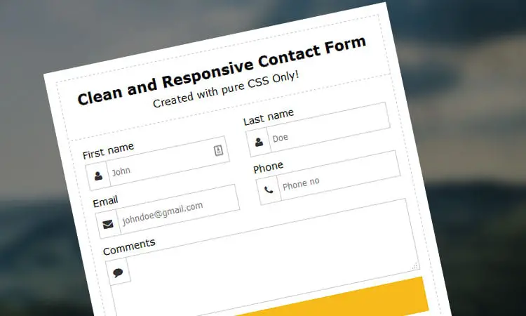
This is the form we will be creating today.

So let’s start:
The form structure
<div class="bg_img"></div>
<div class="form_wrapper">
  <div class="form_container">
    <div class="title_container">
      <h2>Clean and Responsive Contact Form</h2>
      <h3>Created with pure CSS Only!</h3>
    </div>
    <form>
      <div class="row clearfix">
        <div class="col_half">
          <label>First name</label>
          <div class="input_field"> <span><i aria-hidden="true" class="fa fa-user"></i></span>
            <input type="text" name="first_name" placeholder="John" required />
          </div>
        </div>
        <div class="col_half">
          <label>Last name</label>
          <div class="input_field"> <span><i aria-hidden="true" class="fa fa-user"></i></span>
            <input type="text" name="last_name" placeholder="Doe" />
          </div>
        </div>
      </div>
      <div class="row clearfix">
        <div class="col_half">
          <label>Email</label>
          <div class="input_field"> <span><i aria-hidden="true" class="fa fa-envelope"></i></span>
            <input type="email" name="email" placeholder="johndoe@gmail.com" required />
          </div>
        </div>
        <div class="col_half">
          <label>Phone</label>
          <div class="input_field"> <span><i aria-hidden="true" class="fa fa-phone"></i></span>
            <input type="tel" name="phone" placeholder="Phone no" pattern="[0-9]{10}" />
          </div>
        </div>
      </div>
      <div class="row clearfix">
        <div>
          <label>Comments</label>
          <div class="textarea_field"> <span><i aria-hidden="true" class="fa fa-comment"></i></span>
            <textarea cols="46" rows="3" name="comments"></textarea>
          </div>
        </div>
      </div>
      <input class="button" type="submit" value="Sumbit" />
    </form>
  </div>
</div>
Here you have <div class="bg_img"></div> which is the background container and we will blur that with CSS later.
The form has simple html5 validation, it checks for required fields like Name and Email.
It also checks for valid email and phone number formats.
Also Read: Create buttons with CSS only
Keep Reading:
The form css
.form_wrapper {
    background:#fff;
    width:500px;
    max-width:100%;
    box-sizing:border-box;
    padding:15px;
    margin:10% auto 0;
    position:relative;
    z-index:1;
    -webkit-box-shadow:0 23px 4px -21px rgba(0, 0, 0, 0.9);
    -moz-box-shadow:0 23px 4px -21px rgba(0, 0, 0, 0.9);
    box-shadow:0 23px 4px -21px rgba(0, 0, 0, 0.9);
}
.form_container {
    padding:15px;
    border:1px dashed #ccc;
}
.form_wrapper h2 {
    font-size:1.5em;
    line-height:1.5em;
    margin:0;
}
.form_wrapper .title_container {
    text-align:center;
    margin:-15px -15px 15px;
    padding:15px 0;
    border-bottom:1px dashed #ccc;
}
.form_wrapper h3 {
    font-size:1.1em;
    font-weight:normal;
    line-height:1.5em;
    margin:0;
}
.form_wrapper .row {
    margin:10px -15px;
}
.form_wrapper .row > div {
    padding:0 15px;
    box-sizing:border-box;
}
.form_wrapper .col_half {
    width:50%;
    float:left;
}
.form_wrapper label {
    display:block;
    margin:0 0 5px;
}
.form_wrapper .input_field, .form_wrapper .textarea_field {
    position:relative;
}
.form_wrapper .input_field > span, .form_wrapper .textarea_field > span {
    position:absolute;
    left:0;
    top:0;
    color:#333;
    height:100%;
    border-right:1px solid #ccc;
    text-align:center;
    width:30px;
}
.form_wrapper .textarea_field > span {
    border-bottom:1px solid #ccc;
    max-height:35px;
}
.form_wrapper .input_field > span > i, .form_wrapper .textarea_field > span > i {
    padding-top:12px;
}
.form_wrapper input[type="text"], .form_wrapper input[type="email"], .form_wrapper input[type="tel"], textarea {
    width:100%;
    padding:10px 10px 10px 35px;
    border:1px solid #ccc;
    box-sizing:border-box;
    outline:none;
    -webkit-transition: all 0.30s ease-in-out;
    -moz-transition: all 0.30s ease-in-out;
    -ms-transition: all 0.30s ease-in-out;
    transition: all 0.30s ease-in-out;
}
.form_wrapper textarea {
    height:8em;
}
.form_wrapper input[type="text"]:focus, .form_wrapper input[type="email"]:focus, .form_wrapper input[type="tel"]:focus, textarea:focus {
    -webkit-box-shadow:0 0 2px 1px rgba(255, 169, 0, 0.5);
    -moz-box-shadow:0 0 2px 1px rgba(255, 169, 0, 0.5);
    box-shadow:0 0 2px 1px rgba(255, 169, 0, 0.5);
    border:1px solid #f5ba1a;
}
.form_wrapper input[type="submit"] {
    background:#f5ba1a;
    height:50px;
    line-height:50px;
    width:100%;
    border:none;
    outline:none;
    cursor:pointer;
    color:#fff;
    font-size:1.2em;
    -webkit-transition: all 0.30s ease-in-out;
    -moz-transition: all 0.30s ease-in-out;
    -ms-transition: all 0.30s ease-in-out;
    transition: all 0.30s ease-in-out;
}
.form_wrapper input[type="submit"]:hover, .form_wrapper input[type="submit"]:focus {
    background:#daa106;
}
The CSS here makes the entire form structure.
form_wrapper class placed before the input fields if you want to have the same style for all input fields throughout the site.The css3 magic (blur image)

Also Check: Free Responsive Login Form
.bg_img {
    background:url(https://static.pexels.com/photos/168066/pexels-photo-168066.jpeg) no-repeat center;
    background-size:cover;
    background-attachment:fixed;
    -webkit-filter: blur(8px);
    -moz-filter: blur(8px);
    -o-filter: blur(8px);
    -ms-filter: blur(8px);
    filter: blur(8px);
    position:absolute;
    top:0;
    left:0;
    height:100%;
    width:100%;
    z-index:0;
}
Responsive Form media query
@media (max-width: 600px) {
.form_wrapper .col_half {
    width:100%;
    float:none;
}
.form_wrapper label {
    margin:10px 0;
}
}
Here we have added a simple media query to check when the screen size is smaller or equal to 600px to adjust the required elements.
Demo:
If you do like this responsive form do share it with your friends.
Here are some of my favorite website building tools
Thanks for reading the article I hope it was helpful for you. Here are some of my favorite tools that I always use and recommend for website building I hope they will be helpful for you. Please note these are affiliate links, if you do purchase anything using my links I’ll earn a small commission.
Web Hosting: For a new website I like GreenGeeks, I’m using it on this site for over a year now without any problems. They have very affordable plans for beginners and the support is reliable. Their simple setup will get you off and running in no time.
Learn Front End Development: If you want to learn front-end development I recommend Pluralsight, learn from industry professionals. You can try the no-risk 10 days free trial and check the content.
Advertising Network: If you want to increase your ads revenue with Adsense then try using Ezoic, unlike most ad networks it doesn’t need any minimum traffic to get started. It is completely free to use.
The form does not send any message to email. Should there not be some form php file to send mail?
Thanks.
Yes! Uche, you need some PHP and javascript to make the form work on a website, this form is just for front-end use and needs some back-end scripting support.